
A Facebook post featuring an identikit British village fayre poster went viral, sparking widespread mockery and prompting The Independent to cover the phenomenon of “AI poster slop.” In isolation, these generated images are rarely outright ugly—their watercolor textures and pastoral charm comfortably pass a superficial glance. The real paradox lies in what happens when everyday users feed a detailed event brief into the machine: what comes back is inevitably the same homogenous, default template. Seen once, it passes; seen twenty times on local noticeboards, the sheer repetition becomes unbearable.
Statistical probability models naturally regress toward the mean. When you prompt a model for an event poster, it serves up a composite ghost of every generic flyer in its training data. On Hacker News, a discussion dissecting this design dilemma garnered over 1,280 points and 700 comments, capturing the front-page spotlight. Developer John Hartnup published a curated catalog exploring more than a hundred distinct poster style prompts. His stress tests laid bare an uncomfortable truth: generative AI’s biggest flaw on posters isn’t poor rendering technique—it is a total disregard for foundational typography.
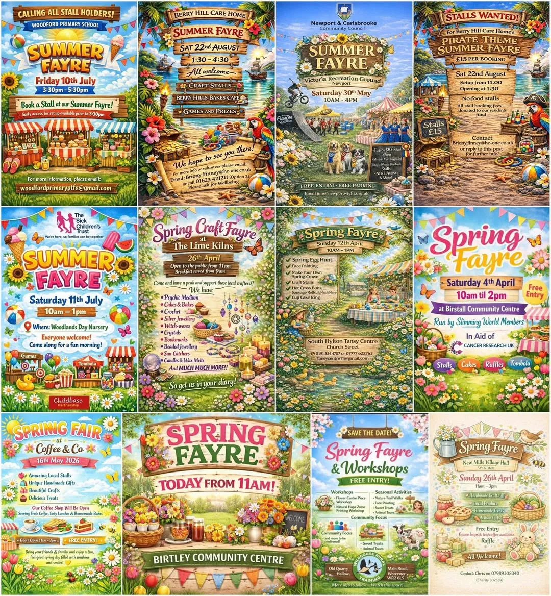 Figure: A collage of AI-generated village fayre posters found online. Source: john.hartnup.uk
Stress-Testing Styles: Specific Art Movements Beat Piles of Adjectives
Hartnup’s experiment began with a fictional spring fayre. He supplied ChatGPT with complete, realistic event details: April 21st from 11:00 AM to 3:00 PM at Mill Beach Park in Honeyford, free entry, featuring a tombola, cakes and drinks, craft stalls, circus skills workshops, and performances by both a samba band and a dhol band. Determined to avoid clichés, his prompt explicitly called for a “clean, unfussy, bright layout with a bold striking spring-themed graphic,” specifically instructing the model to “avoid pastel/airbrush/oil style art or images of people.”
The initial output stubbornly clung to the familiar, kitschy village fete aesthetic. The model effectively ignored the negative constraints, anchored firmly to the default probability distribution triggered by the phrase “spring fayre.” Diffusion models still possess weak control over negative weights, and abstract layout requests crumble in the presence of concrete object nouns. Handed ten event attractions, the model’s instinct was not to structure an informational hierarchy, but to jam ten illustrative tokens onto the canvas.
Hartnup pivoted his strategy. He asked the model for a deliberately different aesthetic, using the previous output as a counter-example of what to avoid. The result was a stark Bauhaus-inspired geometric modernist layout. Merely by breaking away from the default look, the poster instantly leaped out from the sea of generic imagery.
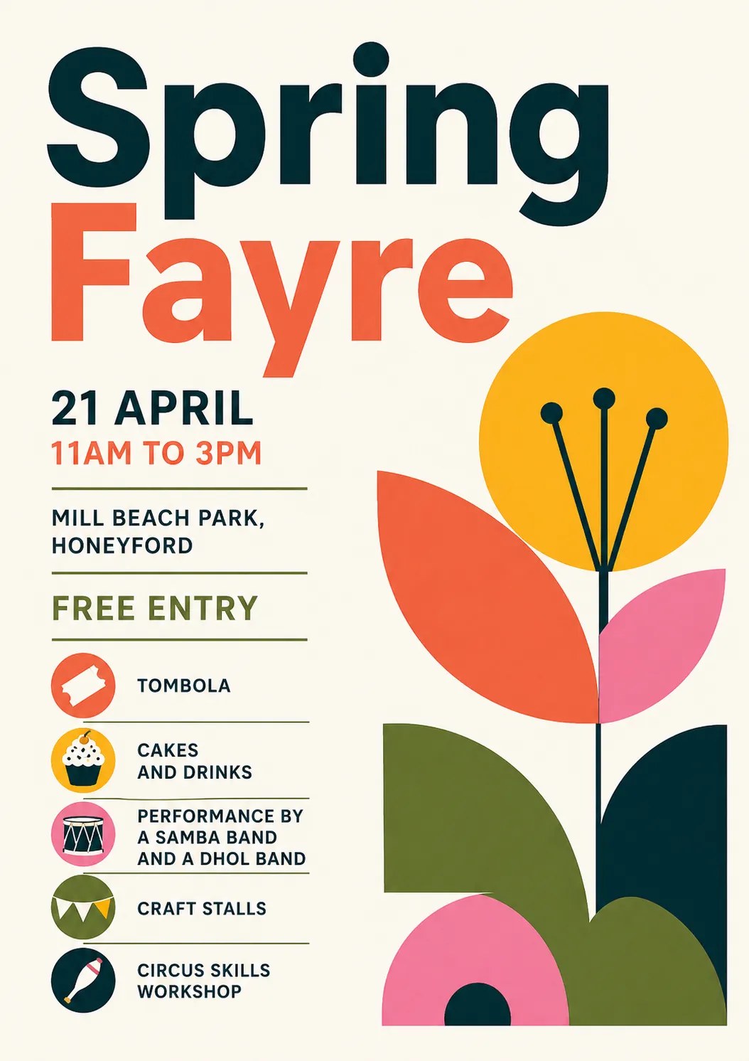 Figure: The author’s second attempt yielding a Bauhaus / geometric modernist style poster. Source: john.hartnup.uk
This breakthrough highlighted a counter-intuitive principle of prompting: specifying a concrete historical art movement—such as a 1940s cubist exhibition poster—is vastly more effective than stacking descriptive adjectives. Historical art movements form tightly clustered feature representations within the training corpus. Referencing a recognized movement indexes an established stylistic cluster directly, producing far more coherent visual grammar than stitching together a dozen subjective adjectives.
ChatGPT easily reeled off dozens of distinct stylistic traditions it could emulate, including several Hartnup had never encountered. The table below illustrates the prompt strategies and output dynamics observed during the experiments:
| Testing Phase | Prompting Strategy | Model Output Movement | Core Evaluation |
|---|---|---|---|
| Initial Test | Avoid pastels and oils, request clean layout | Default village fayre template | Highly repetitive; seeing the same style 20 times becomes grating |
| Negative Framing | Counter-example prompt avoiding prior aesthetic | Bauhaus / Geometric Modernism | Much stronger visual impact; stands out simply by breaking conventions |
| Named Movement | Explicitly specify 1940s Cubism | Cubist exhibition poster | Precise visual execution; far more effective than abstract descriptions |
| Batch Verification | Specify Swiss International Style | (One of 100 catalogued styles) | Confirms named art movements outperform adjective stacking |
| Batch Verification | Specify Risograph printing | (One of 100 catalogued styles) | (Same as above) |
| Batch Verification | Specify Matisse cutout collage | (One of 100 catalogued styles) | (Same as above) |
| Batch Verification | Specify 1990s rave flyers | (One of 100 catalogued styles) | (Same as above) |
Drowning Text in Visual Clutter: A Forced Scavenger Hunt
Even as large models demonstrated an encyclopedic grasp of diverse aesthetics—spanning Brutalism, Memphis Design, and monochrome palettes with a single accent color—their generated compositions remained fundamentally frustrating. In the Hacker News thread, developer eloisant delivered the sharpest diagnosis: the fatal flaw of AI posters is that information must be hunted down rather than grasped at a glance.
“The biggest problem that I have with most AI posters is that they are too busy, you have to look for information instead of seeing it popping right away,” eloisant pointed out. Before AI, amateur flyers slapped together in Microsoft Word by community volunteers rarely committed this specific blunder. No matter how unrefined their taste, human creators intuitively understand that the date, time, venue, and key highlights must be sized boldly enough for pedestrians to read from across the pavement. In contrast, image models smother the canvas in decorative flourishes, samba instruments, and circus paraphernalia, relegating vital event details to an unreadable corner.
Current image generation models lack any concept of text as an informational hierarchy. They treat letterforms merely as colored patches of pixels, on equal footing with flowers, bunting, or trees. Their loss functions optimize for surface density and compositional equilibrium, not reading flow. When fed several lines of text, the output is not a legible announcement, but a visually noisy puzzle.
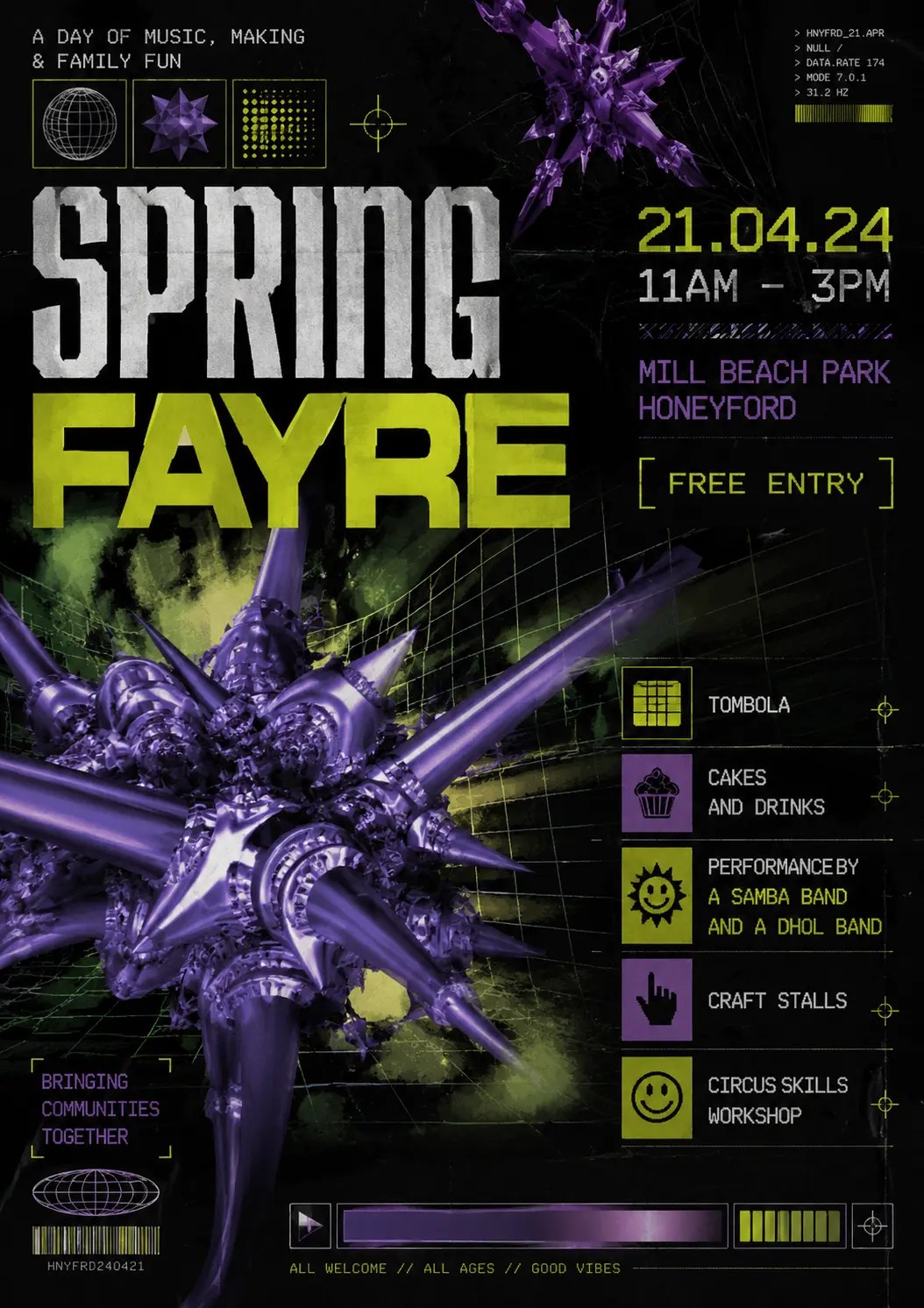 Figure: The 1990s drum & bass flyer style explored by the author. Source: john.hartnup.uk
Handing Out the Paintbrush Without the Editorial Taste
When the technical barrier to image creation drops to zero, visual uniformity is the inevitable outcome. Commenter vintagevibe pinpointed the deeper dynamic at play: a professional graphic designer’s primary value lies in acting as an editor. Designers arbitrate between a client’s sprawling wish list and an audience’s finite attention span, ruthlessly stripping away extraneous elements to deliver clear hierarchy.
Democratizing generation without instilling typographic judgment is what unleashes industrial slop. When no one is willing or able to edit, the machine obliges by welding every requested bullet point into a single, overcrowded Frankenstein graphic. As commenter yellowapple noted, generative AI will not replace skilled designers anytime soon, precisely because clients lack that editorial restraint.
General-purpose generators suffer from a distinct competency void: when tools empower everyone to add elements endlessly, the ability to subtract becomes the scarcest skill. Even Hartnup himself—posting under the handle ereiamjh—conceded the point in the thread. After generating and reviewing a hundred prompts twice over, he realized that nearly all of them suffered from visual overcrowding: “The prompts could be improved by asking for much less clutter… Unless the prompt says otherwise, AI will try to get a visual element in for every single word.”
Layered Code Over Flattened Pixels: Escaping the Bitmap Dead End
To resolve the impasse of uneditable, crowded layouts, Hartnup outlined a far more pragmatic technical path: stop forcing models to composite everything into a single, flattened raster image. Instead, let language models like Claude Code or Gemini generate structured HTML/CSS, vector SVG, or layered PDF files. Under this paradigm, text retains its true semantic character, and layout layers regain their structural independence. A poster ceases to be an unchangeable raster snapshot; it becomes an interactive digital asset where typefaces can be swapped in CSS, positions tuned in the DOM tree, and backgrounds decoupled from foreground information.
From a system architecture standpoint, this represents an elegant strategy of dimensional reduction. If diffusion models struggle with typographic hierarchy, demote them to what they do best: generating background illustrations and isolated visual assets. Delegate layout and typography to large language models adept at structured code.
AI can produce posters that look superficially appealing, but it packs them so densely that they fail to communicate. The debate sparked by Hartnup’s experiments offers a crucial reminder for generative design: tools can effortlessly synthesize millions of dazzling pixels, but they cannot automate the restraint, curation, and negative space that good typography requires. In an era where every pixel can be filled with effortless detail, knowing what to leave out remains the hardest challenge AI has yet to solve.
References:
- AI Event Posters
- Hacker News Discussion